Monday, July 26, 2010
Wednesday, July 21, 2010
Lab 5: Spatial Analysis
Wednesday, July 14, 2010
Lab 4: Working with Tables
This map shows the percent of the population by county that is African American. I was actually very surprised to see that such a high percent of America's African American population is still concentrated in the South, an obvious vestige of slavery. I decided that a scale and a north star were unnecessary for this map (and the following maps). North is beyond obvious, in my opinion, and I felt a scale was irrelevant to this type of informational map.
This is a map of the percent of "other race" by county. I think this map is not very revealing, since "other race" is an extremely broad and obscuring category (as are all of these maps' categories to some extent). But, based on the patterns of concentration in the Southwest and Florida, I suspect many of these people are Latino/Chicano. This map is helps illustrate how significant this population actually is in America, as they are verging on majority status in many counties.
Together, these maps display that "minorities" are rapidly becoming the majority in America. We often hear statements along these lines, but seeing it graphically helps make it seem more real. I think this is an exciting time for America, and the near future holds a lot of potential for eliminating racist beliefs and laws as we all adjust to America's changing identity. It is obvious we as a country need to give more attention to the issues faced by so-called "minorities." As for my experience using the GIS software, I am definitely starting to understand and enjoy it more. By the time I constructed my last map, I could complete it in only a few minutes. I think my maps are coming out cleaner and more aesthetically pleasing than before as well.
Monday, July 12, 2010
Lab 3: Map Projections
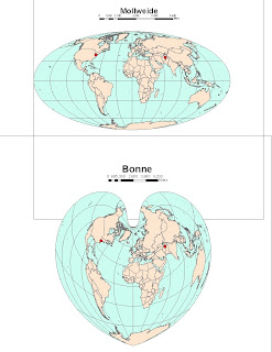
Distances between Washington D.C. and Kabul
Gall stereographic: 7,123.7 miles
Mercator: 10,122.7 miles
Mollweide: 7,900 miles
Bonne: 6,835 miles
Sinusoidal: 8,092 miles
Plate carre 10,112 miles
Gall stereographic: 7,123.7 miles
Mercator: 10,122.7 miles
Mollweide: 7,900 miles
Bonne: 6,835 miles
Sinusoidal: 8,092 miles
Plate carre 10,112 miles
A map projection is a way of interpreting the three dimensional surface of the Earth onto a two dimensional plane. This is useful because it is not often possible to view the Earth in 3D. Unfortunately, though, all projections have to sacrifice accuracy in area, distance, or shape. Projections can be classified according to what qualities they preserve, and each has specific advantages and disadvantages. Clearly, different projections can give startlingly varied representations of Earth's landmasses.
Mercator and Gall stereographic projections are examples of conformal projections. Conformal projections are characterized by parallels and meridians that intersect at right angles. The advantage of this type of projection is that local shapes and angles are preserved, but area can be variant. For example, on the Mercator, area near the poles is lengthened dramatically, which gives the impression that Greenland and Antarctica are extremely large.
The Mollweide and Bonne projections are examples of equal area projections, which maintain a proportional relationship to areas on the Earth the represent. These maps thus give a good idea of how large landmasses are in relation to one another, but are not so useful for determining how far apart things really are. The last set of maps, the Sinusoidal and Plate carre projections, are equidistant maps. These projections maintain uniform distance from the center of the map to any other place on the map. This is very useful when trying to determine distance from a particular location.
Although one usually thinks of distance as absolute, it is clear from the examples above that attributes like it can be warped depending on the map. Because angles, shapes, and areas can vary so much, one must carefully consider what projection is best for the purpose of the map. However, when the scale is very large, this becomes less important, because the distortion is so small.
Thursday, July 8, 2010
Lab 2B: ArcGIS Tutorial
I had a fairly bumpy experience getting through the ArcGIS tutorial. I would not consider myself a "computer person," and being a Mac user thrown into the unknown world of out of date PCs didn't make things easier. I think the most difficult part was navigating Windows, and getting to know how the temporary workspace system worked. I ended up having to do a lot of things over due to improper saving, but it was probably for the better, because it made me more familiar with the software.
The tutorial itself was a little frustrating at first. When following directions from a book (and especially from a PDF), I think it's easy to get into a groove of clicking where you're told, without really understanding what's going on. Especially for some of the more complex operations, I felt there was a lot of jargon, and it was hard to grasp what was really happening. I think in-class/group tutorials are much better because they overcome a lot of these difficulties, and ensure the student is engaged. Regardless, by the time I finally finished the tutorial, I felt like I had a decent grip on what was going on.
It is clear to me that GIS software is very powerful and has a lot of potential. Even just scratching the surface, I was quite impressed with ArcGIS's ability for spatial analysis. I did feel like parts of the program were a little archaic, in a sense, like having to type out your own equations to get population density (vs. just clicking a button?). It seems like it would take a very long time to master all of the functions available in ArcGIS, and it's a little overwhelming.
But just as a tool, GIS is incredibly valuable. The ability to put many layers of information on one map, and to be able to update that continuously is pretty amazing. I'm sure there are applications for GIS that I haven't even begun to think about, which makes the field very exciting. I am glad to be getting into GIS at a time when most of the tedious groundwork and data entry has been completed (thanks!), and to begin analyzing geographic data in constructive ways.
Subscribe to:
Posts (Atom)