Wednesday, June 30, 2010
Lab 2A: Participating in Google Maps
View Los Angeles Art Galleries in a larger map
I decided to make a map of art galleries in Los Angeles. I like visiting galleries, but I'm always overwhelmed by the amount of them in LA. So, I decided to use this class project to organize and locate them for myself. Most relevant galleries are located in 3 main clusters: Culver, Chinatown, and Downtown.
I think neogeography is a very exciting development for both geography, and the internet in general. To me, neogeography contains a lot of exciting potential to make insider knowledge more accessible. For example, I use Yelp to help me pick restaurants. This web 2.0 site allows users to submit reviews of all types of businesses, and one can then view them based on geographic location. It's a great way to see what's good in your neighborhood. I am thus able to benefit from the local expertise of many people. When I think about my own knowledge of Los Angeles, it is clear to me that a good deal of it comes from neogeography; where would I be without Google Maps, Yelp, and the Metro trip planner? Probably very, very lost.
Maybe I am naive, but the pitfalls of neogeography seem few. I am not too concerned with "my info getting out" on the net, since I can control what I put out there. I COULD see a problem if my favorite hole-in-the-wall restaurant gets a lot of good reviews and becomes too crowded, though. But overall I think the sharing of local knowledge will help eliminate bad businesses, and perhaps discourage elitism among Angelenos "in the know," as everyone gains access to insider knowledge.
Wednesday, June 23, 2010
Lab 1B: Reading Topo Maps
1. The name of the quadrangle is Beverly Hills.
2. The adjacent quadrangles are Canoga Park, Van Nuys, Burbank, Topanga, Hollywood, Venice, and Inglewood.
3. The map was first produced in 1966 (and most recently revised in 1999).
4. The datum used was the North American Datum of 1927 and 1983.
5. The scale is 1:24,000
6. a) 5 cm on the map = 1,200 m on the ground.
b) 5 in on the map = 1.894 mi on the ground.
c) 1 mi on the ground = 2.64 in on the map.
d) 3 km on the ground = 12.5 cm on the map
7. The counter interval is 20 ft.
8. a) the Public Affairs Building is at 34.07261 N and 118.43934 W / 34 degrees 4.3566' 21.396'' N and 118 degrees 26.3604' 21.624'' W
b)The tip of the Santa Monica pier is at 34.00743 N and 118.49992 W / 34 degrees .4458' 26.748" N and 118 29.9952 59.712 W
c) the Upper Franklin Canyon Reservoir is at 34.12042 N and 118.41016 W / 34 degrees 702252' 13.512" N and 118 degrees 24.6096' 36.576" W
9. a) the approximate elevation of Greystone Mansion is 560 ft / 170.69 m
b) Woodlawn Cemetary: 140 ft / 42.67 m
c) Crestwood Hills Park: 600 ft /182.88 m
10. The UTM zone is 11S.
11. The UTM coordinates for the lower left corner are around 3762950 and 0361500.
12. 250,000 square meters in each cell of UTM gridlines.
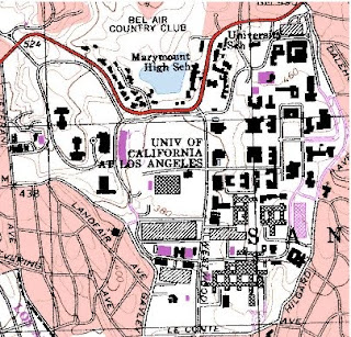
13.


14. The magnetic declination is 14 degrees east.
15. The stream flows south.
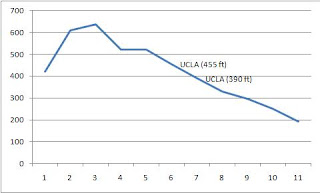
16.


2. The adjacent quadrangles are Canoga Park, Van Nuys, Burbank, Topanga, Hollywood, Venice, and Inglewood.
3. The map was first produced in 1966 (and most recently revised in 1999).
4. The datum used was the North American Datum of 1927 and 1983.
5. The scale is 1:24,000
6. a) 5 cm on the map = 1,200 m on the ground.
b) 5 in on the map = 1.894 mi on the ground.
c) 1 mi on the ground = 2.64 in on the map.
d) 3 km on the ground = 12.5 cm on the map
7. The counter interval is 20 ft.
8. a) the Public Affairs Building is at 34.07261 N and 118.43934 W / 34 degrees 4.3566' 21.396'' N and 118 degrees 26.3604' 21.624'' W
b)The tip of the Santa Monica pier is at 34.00743 N and 118.49992 W / 34 degrees .4458' 26.748" N and 118 29.9952 59.712 W
c) the Upper Franklin Canyon Reservoir is at 34.12042 N and 118.41016 W / 34 degrees 702252' 13.512" N and 118 degrees 24.6096' 36.576" W
9. a) the approximate elevation of Greystone Mansion is 560 ft / 170.69 m
b) Woodlawn Cemetary: 140 ft / 42.67 m
c) Crestwood Hills Park: 600 ft /182.88 m
10. The UTM zone is 11S.
11. The UTM coordinates for the lower left corner are around 3762950 and 0361500.
12. 250,000 square meters in each cell of UTM gridlines.
13.


14. The magnetic declination is 14 degrees east.
15. The stream flows south.
16.


Lab 1A: Pick Three Maps

This map created by the World Bank shows urban outdoor particulate air pollution. It assigns different colored points for varying degrees of pollution intensity. I think this visual representation of global urban pollution is interesting because it gives a good idea of which areas contribute the most. I was surprised to see US cities fared quite well, with most cities dark or light green, because the US is always getting blamed for global warming. Of course it is also no surprise to see developing areas like China and India did poorly. This map may be a little misleading, though, because it only counts PM10 particles, and some of the most dangerous particles to human health are much smaller than that.

Originally published in book called Nordisk Familjebok, the next map I picked is of Stockholm's Gamla Stan, or "old town" district. Although there is no scale on this map, the island is only about a kilometer across, making it an optimal size for walking. I am interested in urban geography, and when I visited Stockholm I was struck by how easy it was to get around without motorized transportation. Gamla Stan struck me as the exact opposite of Los Angeles, with its small, winding cobbled streets, and vibrant street life. Car infrastructure was minimal, but I can't imagine wanting to take a car through anyway. I like how this map pretty much tells you all of that, and that looking at a map of Los Angeles would tell you about its grid layout of megablocks, and you would know it was a city for cars. I love that the different character of the two cities can be ascertained just from looking at a map (at least to some extent).
The last map I sel ected also relates to my interest in urban patterns. This is a map of the growth of Baltimore, Maryland from 1792 to 1992, constructed by NASA using USGS Landsat data. The map therefore spans the majority of American history, and provides a very interesting view of American urban growth patterns. I think it is amazing that urban sprawl has spread so much that almost all land in this snapshot is covered in the last slide, and that was almost 20 years ago! Visuals like this are very helpful to show people how devastating human development has truly been to our environment. To me, the growing sprawl almost looks like a organism, like a mold spreading across the landscape, and I think in a way, the likeness is very telling.

Originally published in book called Nordisk Familjebok, the next map I picked is of Stockholm's Gamla Stan, or "old town" district. Although there is no scale on this map, the island is only about a kilometer across, making it an optimal size for walking. I am interested in urban geography, and when I visited Stockholm I was struck by how easy it was to get around without motorized transportation. Gamla Stan struck me as the exact opposite of Los Angeles, with its small, winding cobbled streets, and vibrant street life. Car infrastructure was minimal, but I can't imagine wanting to take a car through anyway. I like how this map pretty much tells you all of that, and that looking at a map of Los Angeles would tell you about its grid layout of megablocks, and you would know it was a city for cars. I love that the different character of the two cities can be ascertained just from looking at a map (at least to some extent).
The last map I sel
 ected also relates to my interest in urban patterns. This is a map of the growth of Baltimore, Maryland from 1792 to 1992, constructed by NASA using USGS Landsat data. The map therefore spans the majority of American history, and provides a very interesting view of American urban growth patterns. I think it is amazing that urban sprawl has spread so much that almost all land in this snapshot is covered in the last slide, and that was almost 20 years ago! Visuals like this are very helpful to show people how devastating human development has truly been to our environment. To me, the growing sprawl almost looks like a organism, like a mold spreading across the landscape, and I think in a way, the likeness is very telling.
Subscribe to:
Comments (Atom)